Identity Design Process:
Pharma Strategies

I was approached by a good friend to develop a logo for his existing company. The established business had been using a simple typeface to represent their company to this point. With a minor company name change, I was presented with the opportunity to design a logo as well as a brand identity that would bring a cohesive feel to the business. The mark would carry over to PowerPoint presentations, business cards, letterhead, and eventually a website.
Pharma Strategies creates clinical care models directly between employers and physicians to create shared saving for patients with chronic conditions. The client didn’t want anything that resembled a pill or prescription.
Sketches
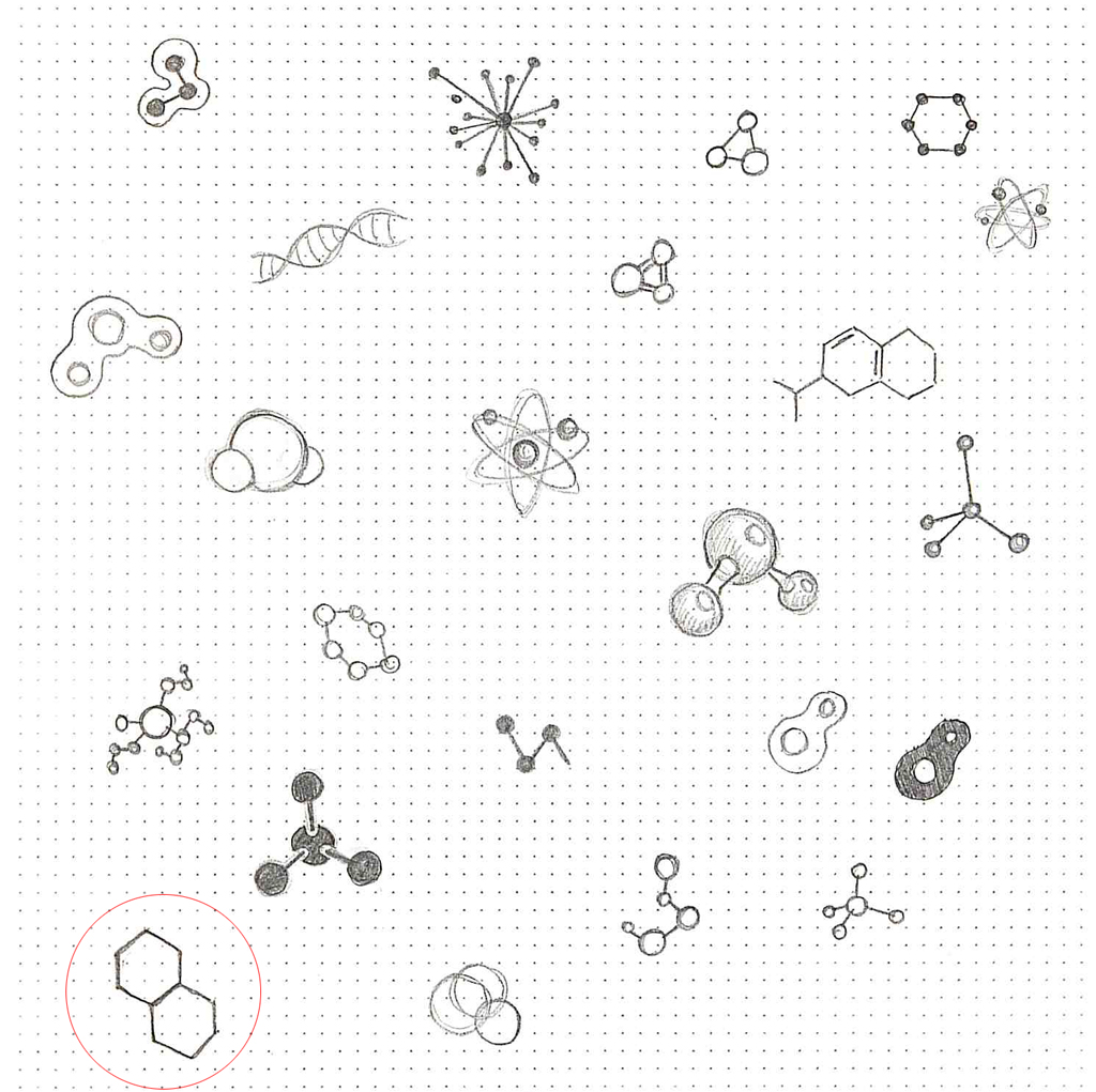
In brainstorming sessions I experimented with broad, general imagery such as atoms and molecules.

I liked the simple shapes what’s known as “chicken wire” when describing organic compounds in chemistry (aka a polycyclic hexagonal chemical structure if you wanna sound smart).
Typeface
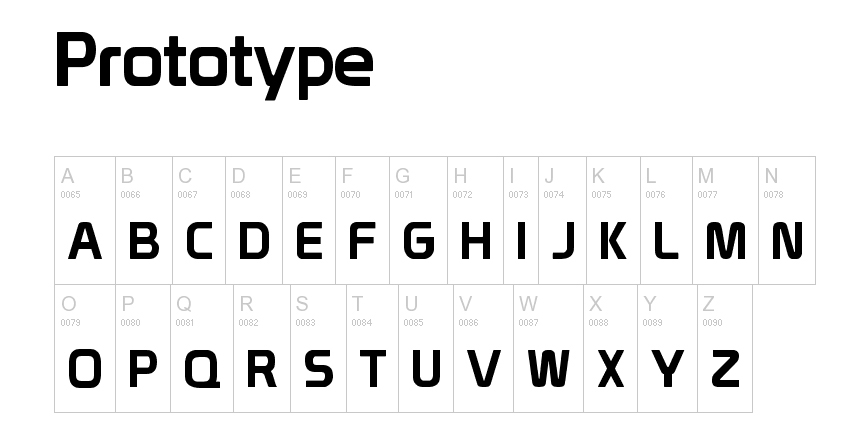
Next was to settle on a typeface. I chose a font called Prototype for it’s modern, clean look.

I wanted to customize the font to better pair the logotype with the molecule artwork. I borrowed from the sharp angles of the hexagon to reshape several letters.

Some further attention to overall spacing.

Color
The maroon color was decided on by the client early on. Several colors were played with for the molecules before deciding on the orange.

The logomark is flexible in color, grayscale, and reversed.

Final Logo
